How Are Silicone Keypad Buttons Differentiated on Portable Blood Gas Analyzers?
- Share
- publisher
- FromRubber
- Issue Time
- Nov 16,2026
Summary
A practical look at how silicone keypad buttons are differentiated on portable blood gas analyzers: button height, top shape, surface texture and printed marking, how those differences survive a compact panel layout, and which checks belong before mold development.
A handheld blood gas analyzer often gives the operator a control area smaller than a payment card, and that area still has to carry eight to twelve functions. The person using it is usually standing, wearing gloves, and watching the result rather than the keys. That is the point where button differentiation stops being a styling question. If the confirm key cannot be found by thumb, the analyzer is slower than it should be, and the wrong key gets pressed at the moment when a second attempt is expensive.
This article is about the interface side of that problem, not about how a blood gas analyzer measures a sample. It looks at how silicone keypad buttons can be made physically distinguishable inside a small panel, what each differentiation method costs in mold detail, and what a product team should settle before tooling starts.
In short: differentiation works when the confirm key differs from its neighbours in at least two channels, usually height plus either top shape or surface texture, and when that difference still reads on the assembled panel at arm's length. Print is the weakest channel on its own, because a glove cannot read it.
Why Similar-Looking Buttons Can Make a Portable Analyzer Harder to Operate
Keypad reviews usually happen on a CAD screen zoomed to 400 percent, where every button is clearly separate and every legend is readable. The same panel at arm's length, under a hospital ceiling light, with a glove on, reads very differently. Buttons that were distinct on screen merge into one grey field, and the operator falls back on reading labels one at a time.
The cost is not dramatic. It is a half-second pause before the confirm key, a second glance at the panel, a thumb that lands between two keys. Repeated a few hundred times a week, those pauses are the difference between a panel that feels considered and one that feels crowded.
Different Controls May Need Different Physical Identifiers
Not every key on an analyzer carries the same weight. A measurement start key, a confirm key, four navigation keys and a set of secondary menu keys are used at completely different frequencies. Treating them as one family of identical buttons is the most common reason a compact panel feels harder to use than its function count suggests.
A practical approach is to assign one physical identifier per functional rank: the confirm key gets a larger top face or a taller crown, the navigation cluster gets a shared shape language, and secondary keys stay visually quieter. The operator then learns the panel as three groups instead of eleven individual keys.
Compact Panel Layouts Leave Less Room for Visual Separation
When the panel is tight, the gap between adjacent buttons shrinks before anything else. Printed separator lines and color blocks are the first things to disappear, because they need clear space to read. What remains is the physical shape of the silicone itself, which is why molded differences carry more of the identification load on small instruments than on desktop equipment.
Repeated Button Shapes Can Make Similar Functions Harder to Identify
People recognize patterns faster than they read words. A panel where every button is a 10 mm round dome with the same radius and the same matte finish gives the eye one pattern repeated eleven times. The labels differ, but the shape memory does not, so the hand has nothing to confirm that the thumb is on the right key.
The fix is usually not more color. It is a small number of deliberately different shapes, used consistently, so that each shape means something. Two or three shape families are enough on a handheld analyzer; beyond that, the panel becomes a puzzle instead of a map.
Which Silicone Button Features Help Users Distinguish Different Functions?
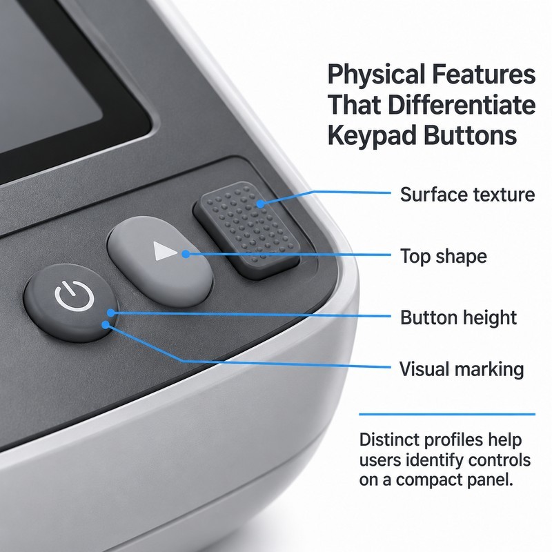
Silicone gives a designer four usable differentiation channels: how far a button stands above the panel, what shape its top face has, how that face feels under a finger, and what is printed or molded onto it. Each channel costs something different in tooling, and each one fails in a different way after a year of cleaning.
The strongest panels combine at least two channels on the keys that matter, and deliberately keep the rest quiet. A confirm key that is taller and has a different top shape is found by touch alone. A confirm key that is only printed differently is found by looking.
On the panel above, the three keys carry three different signals: a low round key, a raised oval key and a rectangular key with a textured top. Nothing about the layout changed, and nothing was added to the panel. The differences live entirely in the molded part.
Use Different Button Heights to Create Clear Physical Differences
Height is the most reliable channel because it works through a glove. A key that stands 0.8 mm above its neighbours can be found without looking, while a key that differs by 0.2 mm is effectively the same key to a thumb. The useful step between levels is larger than most drawings assume, and it should be checked on a physical sample rather than on a section view.
Height also interacts with the panel. A button that protrudes far above a recessed opening is easy to find but catches on pockets and sleeves, and it changes how the silicone web stretches when pressed. On a handheld analyzer, the tallest key is usually the one most often pressed, not the one that looks most important on the drawing.
Adjust Button Shapes to Make Important Controls Easier to Recognize
Round, oval, rectangular and contoured tops each read differently under a finger. A rectangular key has corners that tell the thumb where its edge is; an oval key gives direction without corners; a round key gives no orientation at all, which is fine for a repeated function and poor for a single critical one.
Shape should follow function and the surrounding layout, not the other way round. A row of arrow keys works as four identical shapes because the printed arrows carry the meaning. A standalone confirm key does not, because there is no neighbour to compare it with.
Add Surface Texture to Distinguish Buttons by Touch
Texture is the channel most often skipped, and it is the cheapest one to add during mold design. A fine matte finish, a shallow rib pattern or a small raised dot field all change what a fingertip reports. The differences survive gloves better than legend contrast does, because a glove reads geometry, not print.
Texture also has a cleaning dimension. Deep grooves collect residue from wipes and disinfectants, and very fine textures can polish smooth over time. On instruments that are wiped between patients, shallow and open patterns hold up better than dense cross-hatching, and they are easier to mold without short shots in the corners.
Combine Button Color and Printed Symbols for Faster Identification
Color and print help, but they help the eye, not the hand, and color on its own does not make operation correct. A red key still needs a shape an operator can find when the panel is angled away, and a printed legend still needs a font size that survives repeated wiping.
Print quality is a separate engineering decision from button geometry. Silkscreen, laser-etched recessed legends and molded-in symbols behave differently under alcohol wipes, and a legend that fades turns a differentiated key back into a blank one. It is worth choosing the marking method at the same time as the shape, not after the mold is cut.
| Differentiation channel | What the operator reads | What it costs in tooling |
|---|---|---|
| Button height | Position of the key under a finger, through a glove | Mold depth and web design; needs sample verification |
| Top shape | Outline and orientation of the key | Cavity detail; simple to change before tooling, costly after |
| Surface texture | Fine tactile pattern on the top face | Mold finish and venting; watch residue build-up |
| Color and print | Visual identification at a glance | Secondary printing or molding step; check wear resistance |
Used together, these channels let a small panel stay small. The alternative, spreading keys out to make them easier to tell apart, is usually not available on a handheld instrument.
How Should Button Differentiation Be Planned Within a Compact Keypad Layout?
Individual button features only work if they survive the full layout. A key that is clearly different on its own can disappear once eleven neighbours are placed around it, because the eye compares within groups and the thumb compares against whatever it touched last.
Planning therefore happens at panel level: decide the functional groups first, then give each group one identifier, then check that the identifiers still read at real spacing and real finger size.
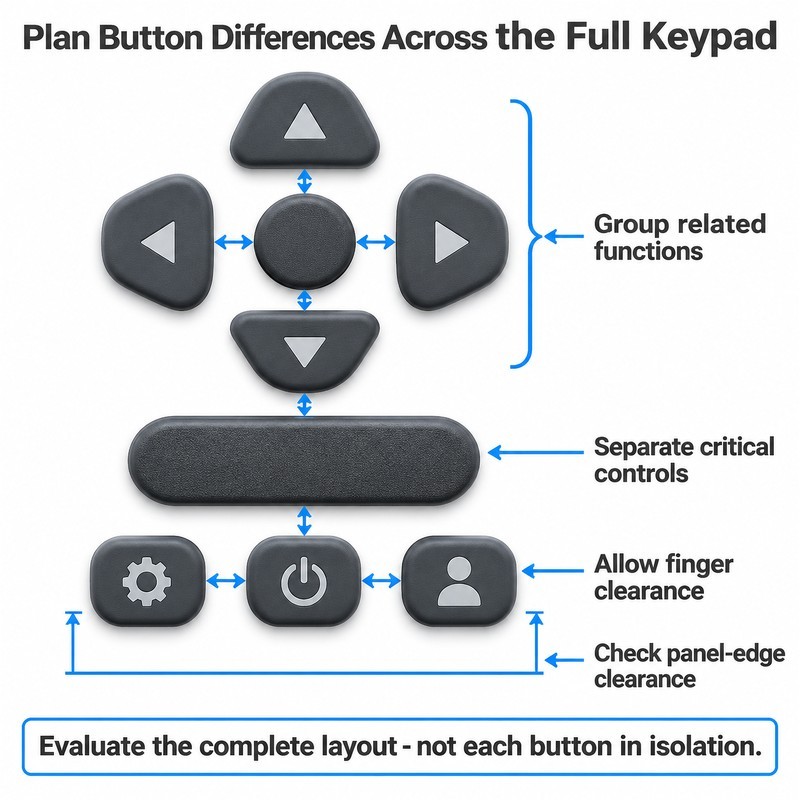
The layout above separates navigation from confirmation and secondary keys with a mix of shape and height rather than color blocks, so the difference remains visible when the panel is produced in a single silicone color.
Group Buttons According to Their Operating Functions
Navigation, confirmation and secondary functions behave differently in use. Navigation is repeated and directional, confirmation is decisive and usually pressed last, secondary keys are occasional. Placing them in three distinct zones, each with its own shape language, gives the operator a coarse map before any label is read.
Grouping also reduces the number of distinctions the mold has to carry. Three shape families across eleven keys is a manageable tooling task; eleven unique shapes is not, and the resulting part becomes expensive to inspect and easy to mix up at assembly.
Leave Enough Space Around Buttons for Reliable Finger Access
The spacing that matters is the clear gap between the edges of adjacent keys, not the center-to-center distance on the drawing. A 12 mm center distance sounds generous until the keys are 10 mm wide, which leaves a 2 mm gap that a thumb cannot feel.
Contact area is the other half of the calculation. A gloved fingertip covers noticeably more of the panel than a bare one, and a key that sits comfortably under a bare thumb can be ambiguous under a nitrile glove. If the instrument is used gloved, the sample review has to be done gloved.
Check Button Height Against the Surrounding Panel Surface
Protrusion is relative. A 1.2 mm key in a flat panel looks tall; the same key in a deep recess looks flush and gives no tactile cue at all. Panel thickness, bezel height and the recess around the keypad all change the effective height the operator feels, so the geometry should be reviewed in the assembled panel, not as an isolated silicone part.
The same check covers accidental activation. Keys that stand proud of a recessed opening are easier to press by accident when the instrument is carried in a pocket or set down on a bench. A slight recess around secondary keys is often a better answer than lowering the keys themselves.
What Should Engineers Check When Developing Custom Silicone Keypad Buttons?
Most differentiation problems are settled before the first cut of steel, in the drawings and in the assumptions behind them. The checks below are the ones that most often change a design, and they are cheaper to run as a review than to discover in a sample.
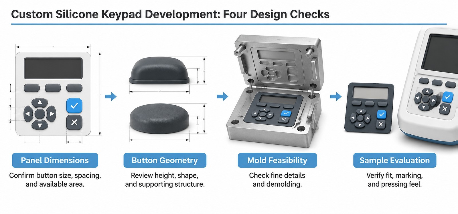
Confirm Button Dimensions and the Available Panel Space
Diameter or length and width, height, edge gap, center distance and the position of every key relative to the panel opening should be fixed before mold design. The most useful drawing for this stage is a full-size panel layout with the silicone outline and the panel cut-out on the same sheet, because that is where interference shows up first.
It also helps to state which dimensions are critical and which are flexible. A tolerance applied to every dimension equally forces the mold maker to chase numbers that do not affect function, while the two dimensions that really matter, usually the perimeter fit and the key heights, get no extra attention.
Select Silicone Hardness According to Button Geometry and Operating Feel
Hardness influences how much a key deforms, how much force it takes to bottom out and how quickly it returns. A tall, narrow key in a soft compound can feel vague and rock sideways; the same key in a harder compound feels crisp but may need more force than a gloved operator wants to apply repeatedly.
There is no universal hardness for analyzer keypads. The right value depends on key height, web thickness, the switch underneath and the intended pressing feel, and it should be chosen as a set with the geometry rather than as a standalone material decision. Testing two hardness options on the same geometry is usually more informative than arguing about a single number.
Review Mold Design for Small Raised Features and Surface Details
Small raised features are where differentiation meets toolmaking. A 0.3 mm step, a fine rib pattern or a tight corner radius may look reasonable on a drawing and still be marginal in a compression mold, depending on how the cavity is cut, where the parting line falls and how the part releases.
This is also where the cost of differentiation concentrates. Each distinct key shape adds cavity detail and inspection points, and a design with five shape families will always be more expensive to tool and to control than one with three. Reviewing the shape set for moldability before the cavity is cut is cheaper than simplifying it afterwards.
Evaluate Marking and Color Requirements Before Mass Production
Symbols, legends and color are usually decided late, after the silicone geometry is frozen, and that is the wrong order. The marking method affects surface flatness, the ink or laser contrast, and how the key behaves under cleaning. A legend that needs a perfectly flat top face constrains the top profile; a molded-in symbol changes the cavity.
Color consistency deserves its own note. Multi-color silicone and painted keys are produced in batches, and matching a specific shade across keys, bezel and housing is easier when the color is defined early and checked against a physical standard rather than a screen value.
A useful habit at this stage: print the panel at 1:1, place it under the actual instrument lighting, and press it with a gloved finger. Most differentiation problems are visible in that five-minute test, long before a mold exists.
Common Design Problems That Can Affect Silicone Keypad Button Differentiation
The same three problems turn up on compact analyzer panels with striking regularity. None of them is a material fault. All of them are decisions that looked acceptable on a drawing.
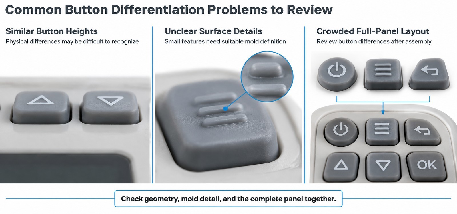
Raised Buttons May Become Difficult to Distinguish When Their Heights Are Too Similar
A 0.3 mm height difference between two adjacent keys is measurable and invisible. If the intent is tactile differentiation, the step has to be large enough to feel through a glove, and it has to be consistent across the part. Two keys that differ by a step the operator cannot perceive are, in practice, the same key.
Small Surface Details May Lose Clarity During Molding
Fine textures and shallow engraved symbols have a habit of filling in or rounding off. Venting, material flow and cavity finish all affect whether a 0.1 mm detail appears as designed or as a soft smear. If a texture is meant to be felt, it needs enough depth to survive molding and enough openness to survive cleaning.
Button Differences May Disappear When the Keypad Is Viewed as a Complete Assembly
Approving keys one at a time hides the only view that matters. Once the part sits in the panel, surrounded by a bezel and viewed at arm's length under real light, small differences flatten out. Reviewing the complete assembled panel, at real distance, with the intended glove, is the check that catches this.
What Information Should Buyers Provide When Requesting Custom Silicone Keypad Quotes?
A quote is only as useful as the information behind it. For a differentiated keypad, the supplier needs to understand not just the shape but the reason each key is shaped that way, because that determines which dimensions can move and which cannot.
- Instrument application and the environment the keypad will be used in, including cleaning routine and glove use.
- Overall keypad dimensions, panel opening and mounting method.
- Button quantity, individual dimensions, height and edge-to-edge gaps.
- Required shapes and heights per function, with a note on which differences are functional and which are cosmetic.
- Silicone hardness if already specified, or the pressing feel the design is aiming for.
- Color and surface texture requirements, including any anti-slip or tactile intent.
- Printed symbols, legend style and the expected cleaning exposure.
- Expected operating method: one hand, two hands, gloved, in low light.
- Drawings, CAD files or a reference sample showing the panel and any existing keypad.
- Prototype quantity and expected production volume.
Supplying a photograph of the assembled instrument alongside the drawing is often more useful than a perfect CAD file, because it shows the bezel height and the distance the operator actually works at.
Frequently Asked Questions
How many different button shapes are practical on one keypad?
Two to three shape families are usually enough for a handheld analyzer. Each additional family adds cavity detail, inspection points and a new opportunity for the operator to confuse one shape with another, so the benefit drops quickly after the third.
Can button differentiation be added to an existing mold?
Height and texture changes generally require cavity work and sometimes a new insert. Printed legends are easier to change than geometry, which is why marking is often revised after the first sample while shape is not.
Does a harder silicone make buttons easier to distinguish?
Hardness affects how a key deforms and returns, not how easily it is identified. A harder compound can make a small key feel more definite under a finger, but shape and height still do most of the identification work.
How much height difference is needed for tactile identification?
It depends on the glove, the key size and the surrounding panel. The practical test is a physical sample pressed by the intended user group: if the difference is not noticed without looking, it is not large enough, whatever the drawing says.
Will textured buttons be harder to clean?
Open, shallow textures clean more easily than dense fine patterns. If the instrument is wiped frequently, choose a texture that a wipe can reach and avoid deep undercuts where residue can collect.
What is the most common cause of a crowded-looking keypad?
Fitting the function count to the panel without reducing the number of distinct shapes. Panels that reuse two or three shapes and separate functions by grouping look calmer than panels where every key is individually designed.
Conclusion: Better Button Differentiation Starts With Custom Keypad Design
Button differentiation on a portable analyzer is a coordination problem. Height, shape, texture and marking each carry part of the message, and the layout decides whether those messages survive at real spacing. Get the coordination right and the panel can stay small; get it wrong and no amount of color compensates.
FromRubber works on custom silicone keypads for instrument and medical device programs, from button geometry and silicone material selection through mold development, sampling and production planning. Most of the differentiation questions in this article are settled in a drawing review before tooling, which is also the cheapest place to settle them.
Sources and Further Reading
- Tactile feedback silicone rubber keypad with dome switch design product reference for dome and actuation structure.
- Why medical monitors keep using silicone keypads over touchscreens background on physical controls in medical instrument interfaces.
- Why silicone keypad dome collapse happens on medical syringe pumps related failure analysis for medical device keypads.
- Meter and instrument keypad range examples of instrument keypad construction.
- IEC 60601-1:2005+AMD1:2012+AMD2:2020, Medical electrical equipment, Part 1: general requirements for basic safety and essential performance, is the reference for the usability engineering process that governs control identification on analyzer interfaces.
- IEC 60529:1989+AMD1:1999+AMD2:2013 defines the IP code used to describe the degree of protection provided by enclosures, which is relevant when keypad geometry is reviewed together with panel sealing.
Working on an analyzer keypad?
Share the panel drawing, the button list and the operating conditions. FromRubber reviews button geometry, silicone hardness, mold feasibility and sample requirements, and returns comments before tooling is committed.
Send drawings for an engineering review
FromRubber is the export brand of Dongguan Bohao Electronic Technology Co., Ltd., Qiaotou, Dongguan, China. IATF 16949:2016 and ISO 9001:2015 certified.