Top 10 Factors to Compare When Selecting Silicone Labels for Footwear
- Share
- publisher
- FromRubber
- Issue Time
- Oct 14,2026
Summary
Footwear presents many different substrates on one product, so silicone labels for footwear have to be matched to the position they occupy rather than chosen by material alone. This guide compares ten selection factors and sets out the questions and validation steps worth completing before a sample is committed to.
The same silicone label can be a good decision on the tongue of a trail shoe and a bad one on the heel counter of a running shoe, even when the artwork is identical and the dimensions are within a millimetre. Footwear does not present one substrate. It presents a dozen, arranged on surfaces that bend, rub, get wet and occasionally get dragged across a kerb.
Selecting silicone labels for footwear is therefore an application-matching exercise rather than a material-shopping exercise. The label has to work with the structure it sits on and the conditions that structure experiences, and those two things change completely depending on where on the shoe the label is placed. This guide sets out ten factors worth comparing, in the order they usually need to be resolved, and the questions worth putting to a manufacturer before a sample is committed to.
Why Footwear Labels Need Application-Specific Selection
Compare the conditions at different positions on one pair of shoes. A shoe tongue is a flexible, cushioning surface that compresses under laces and flexes every step. The upper is a curved, load-bearing surface that may be knit, woven or coated. The heel area is frequently rubbed, sometimes against the shoe itself and sometimes against a car boot. A side panel is large and mostly stable but curves in two directions. A strap flexes sharply at its anchor points. Interior surfaces may be out of sight but are often the ones that contact a sock or skin continuously.
Those positions do not just vary in how much abuse they take. They vary in what kind of abuse, and the difference matters more than the amount. A label that resists abrasion well may still be a poor fit for a surface that flexes repeatedly, and a label that follows a curved surface beautifully may be the wrong choice for one that gets scuffed.
The practical conclusion is that the best selection depends on the shoe structure, the intended use, the attachment method and the visual design together. Appearance alone is a poor guide, because it is the one factor that does not change between the shoe that works and the shoe that does not.
The Ten Factors
Factor 1: Intended placement on the shoe
Placement determines dimensions, flexibility, edge design, visibility and attachment requirements. A label for a tongue is usually read at a glancing angle and must tolerate compression; a label for a side panel is read more directly and has more space to work with; a label near a heel needs to survive contact. Confirm the exact placement and the usable surface area before the artwork is finalised, because available area is what constrains aspect ratio, and aspect ratio drives the geometry of everything inside the label.
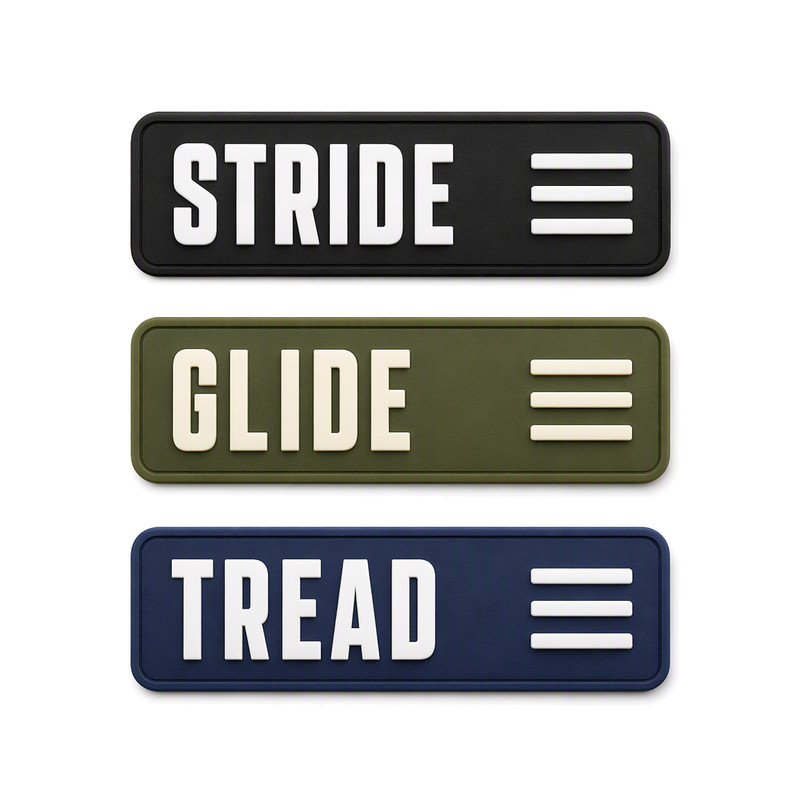
Footwear is often given more than one label, and the parts of the shoe they sit on are not equivalent. In the set shown here, three word marks share the same proportions but are produced in different colours, which is normal practice when one design language has to survive on several colourways without being redrawn.
The horizontal format, the wide strokes and the compact secondary mark all suit a tongue or an upper panel: the label reads at a glance, and no feature inside it depends on being viewed close up. Moving the same label to a narrow heel tab, however, would force a different aspect ratio and a different internal layout.
Tongue and upper labels: a horizontal format with wide strokes reads well at a glancing angle and under lace compression.
Factor 2: Attachment method and compatibility with the shoe material
Sewing, heat transfer, adhesive-based attachment and other construction-specific routes each place different demands on the label and on the material it meets. Not every silicone label construction supports every attachment method, and the method has to be chosen alongside the material rather than after it.
Compatibility is where footwear becomes genuinely varied. Knit uppers, woven textiles, coated and laminated materials, synthetic uppers and foam-backed panels each respond differently to heat, to pressure and to stitching. A construction that suits a stable woven panel may be unsuitable for a heat-sensitive coated surface, and a sewn construction may be impossible on a material that will not hold a stitch without reinforcing. Attachment feasibility should be confirmed for the actual material and the actual production process, not for a similar-looking one.
Factor 3: Flexibility and label thickness
Thickness and stiffness govern how the label bends with the shoe, how it behaves at the edges, and how it feels. A structured external logo on a rigid panel and a label on a flexible, body-contacting area are optimising for different outcomes.
It is tempting to treat thinner as better. It is not, in either direction. A very thin label may lack the structural stability to hold a raised design or to stay visually distinct from a busy upper, while a thick label can dominate a lightweight shoe and concentrate stress at its perimeter when the surface flexes. Thickness should follow from the placement, the design intent and the durability requirement together.
Factor 4: Resistance to abrasion and repeated contact
Footwear labels are exposed to rubbing from use, from handling, from adjacent components and from cleaning. Raised features present more material to the surface that rubs against them, and exposed edges catch on things. Placement determines how much of that pressure a label receives, which means two identical labels at two positions on one shoe can age very differently.
Abrasion behaviour should be evaluated on the finished construction on the intended shoe rather than inferred from the material name alone. Where a comparable number is needed, it has to come from a defined method rather than from an impression: SATRA publishes numbered test methods for materials and components, including TM167 for colour fastness to rubbing by crockmeter, and a named method is what makes two results comparable. Silicone labels do not all share one abrasion profile; formulation, hardness, surface finish and geometry all contribute.
Factor 5: Water, moisture and cleaning exposure
Footwear meets rain, sweat, moisture from the ground, cleaning products and a range of drying conditions, from a warm room to a hot car. Two separate questions are involved here, and they are often merged by accident.
The first is how the silicone material itself behaves when wet. The second is how the complete label attachment performs, which depends on the substrate, the interface and the process used. A material that is unaffected by water can still be part of a joint that is not. Define the expected use environment and evaluate the finished construction under conditions that resemble it. Where the shoe or its components will be machine washed, the test conditions themselves need to be fixed: ISO 6330:2021 defines 16 washing procedures on Type A reference machines, 12 on Type B and 7 on Type C, plus six drying procedures, and without a named procedure two wash results cannot be compared.
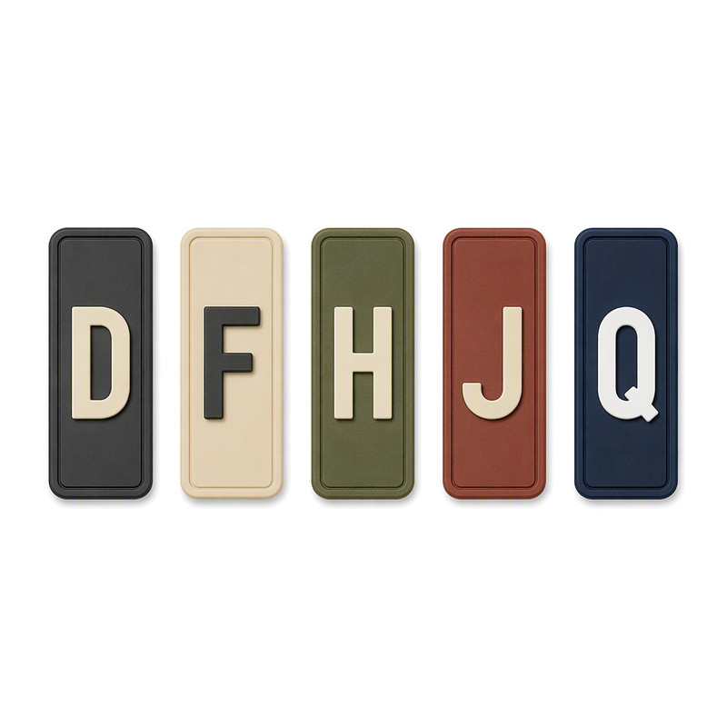
Narrow heel tabs: the aspect ratio, not the artwork, is what limits how much detail fits.
The heel tab is a good example of how placement reshapes a design. There is usually much less width available than on a tongue or a side panel, so the label becomes tall and narrow, and a tall narrow format changes what can be placed inside it. A single raised character and a fine rim will fit comfortably. A word mark and a secondary symbol usually will not, however carefully they were drawn for the larger position.
It also illustrates a second point about repeat orders. The same tab is often produced across several colourways, so the reference sample and the acceptance criteria need to describe what stays constant — the geometry and the character form — separately from what is allowed to change.
Factor 6: Logo detail, colour and surface finish
Small lettering and thin lines, raised or recessed detail, multicolour design, matte or gloss finish, and the contrast between the logo and the shoe material all interact with each other and with the size of the label. Detail that reads well on a 40 mm panel may not read on a 15 mm tab, and colour contrast can make a marginal design legible without changing any geometry — or fail to rescue one that is already merged.
Review the artwork at the intended physical size and confirm colours against agreed references. On footwear, this step deserves more attention than usual, because the upper is rarely a plain background: the label often sits on a texture, a mesh or a printed panel, and the visual contrast is judged against that, not against white paper.
Factor 7: Edge shape and integration with the shoe surface
Outline geometry, corners, borders and edge thickness matter more on footwear than on flat apparel panels, because the surfaces are curved and the panels are narrow. Two geometry problems recur. The first is a corner or edge that sits close to a seam or a fold, where it is vulnerable to lifting and to being caught. The second is a label that has to follow a compound curve, where a stiff, thick edge will stand proud while a thinner, more compliant one will follow.
Confirm clearances from stitching, folds and adjacent components before approving dimensions. A few millimetres of clearance is usually cheaper to design in than to recover later.
Factor 8: Colour stability and appearance requirements
Sunlight exposure, rubbing, moisture and cleaning are all part of footwear life, and the appearance requirement should be defined against the use the shoe is actually intended for. A performance shoe used three times a week and a display shoe in a shop window have different exposure profiles.
It helps to separate the appearance of the silicone body from the appearance of any printed or coated surface features, because the two age through different mechanisms. Colour stability and surface durability should be evaluated on the actual material and finish rather than inferred from appearance, and claims about universal resistance to light or fading should be treated as claims, not as properties.
Outdoor and performance footwear tends to use the same small vocabulary of motifs, and the reason is practical rather than stylistic. A mountain silhouette, a wave, a star or a short word mark stays recognisable at the sizes a shoe panel allows, and none of them depends on fine detail.
They also show why colour contrast deserves a place in the specification. In this set, the visual separation comes from the difference between the base colour and the raised colour, not from the height of the relief. Where contrast is doing the work, the design can often be simplified without losing anything.
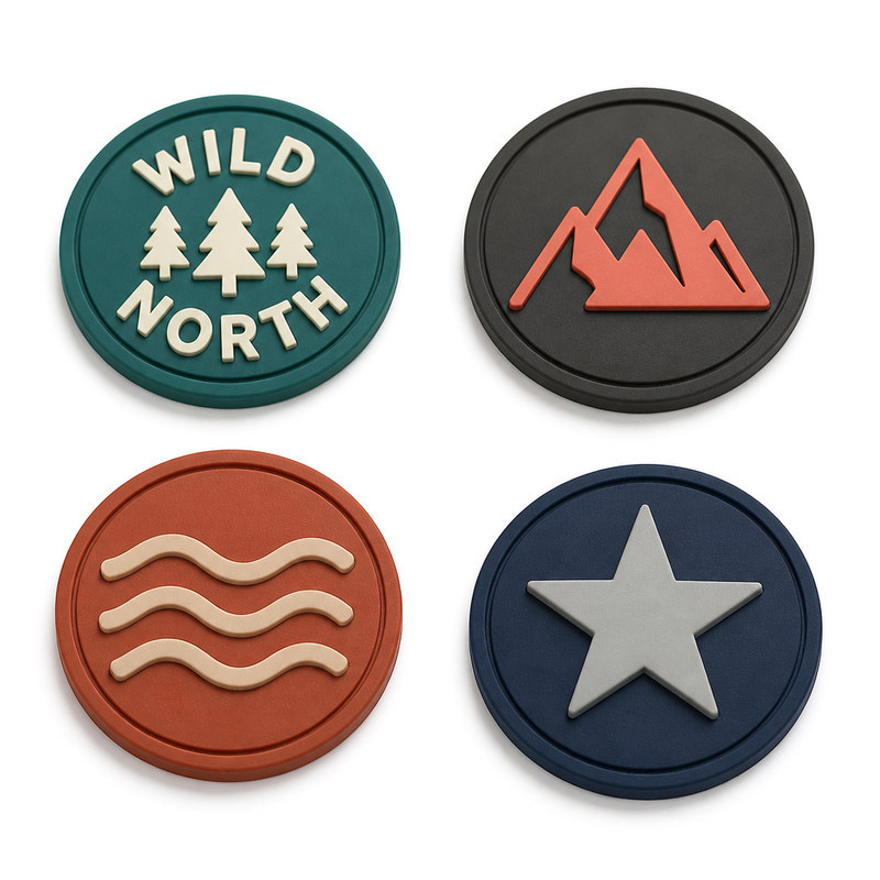
Two-colour raised badges: the outdoor graphic language common on footwear uppers, where contrast does a lot of the work.
Factor 9: Production consistency and quality inspection
Define which characteristics must remain consistent across production batches: dimensional consistency, colour matching, logo definition, surface condition, edge quality and any attachment-related criteria. Then decide how each one will be checked and against what reference.
Footwear brands often run the same label across several colourways and several shoe models, which makes repeat-order consistency more important than it first appears. A label that varies slightly within a single batch is an internal issue; the same variation across a repeat order becomes a visible mismatch on a shop shelf. Batch identification and sample retention make that comparison possible. Defect rates, tolerances and acceptance limits should come from the agreed specification and the actual process, not from a generic figure.
Factor 10: Customisation, tooling and order requirements
Logo complexity, dimensions, relief, colour count and attachment requirements all feed into how a project is planned and what tooling it needs. Reviewing artwork and application requirements before tooling and sample development is what keeps the plan realistic.
Order quantity, sampling, repeat-order consistency, packaging and delivery expectations should be settled at the same time. It is worth separating the initial tooling burden from the total project cost, because they are not the same thing. A tooling route with the lowest initial cost can cost more overall if it produces a label that needs design changes after sampling, or one that is difficult to apply consistently on the intended upper.
Evaluating Silicone Labels for Footwear
| Selection factor | Why it matters | Questions for the manufacturer | Suggested validation |
|---|---|---|---|
| Placement on the shoe | Drives dimensions, flexibility, edge design and visibility | What surface area is available, and what is the label read from? | Mark the position on the actual shoe last or panel and check aspect ratio |
| Attachment and material compatibility | Determines whether the label can be fixed reliably at all | Which constructions suit this upper material and this factory process? | Confirm against the production material and process, not a comparable one |
| Flexibility and thickness | Affects comfort, bending and how the edge behaves | What thickness range suits this placement and design intent? | Assess on a finished shoe during movement |
| Abrasion and repeated contact | Rubbing varies enormously by position | How do raised features and edges behave under contact? | Evaluate the finished construction on the intended shoe |
| Water, moisture and cleaning | Footwear meets rain, sweat and cleaning agents | Which part of the construction is being assessed: material or joint? | Test the complete label on the production substrate |
| Logo detail, colour and finish | Detail and contrast decide readability on a busy upper | Does the artwork hold at the intended size on this material? | Review artwork at final size; confirm colour against a physical reference |
| Edge shape and integration | Curves, seams and narrow panels concentrate stress | What clearances are needed from stitching and folds? | Check fit on the panel before approving dimensions |
| Colour stability and appearance | Exposure depends on the shoe's real use | How are silicone body and any printed feature assessed separately? | Evaluate on the actual material and finish, under relevant exposure |
| Production consistency | Repeat orders appear side by side in retail | What is the reference sample and what are the acceptance criteria? | Written criteria plus retained batch samples |
| Customisation, tooling and orders | Tooling burden is not the same as total project cost | What is required before tooling, and what changes cost money later? | Design review before tooling; agree sampling and repeat-order expectations |
How to Build a Footwear Silicone Label Specification
The specification should describe the actual shoe application, not only the label. Working through these steps in order avoids the common situation where the artwork is approved first and the application constraints are discovered afterwards.
- Identify the footwear type and the exact label location on the shoe.
- Confirm the substrate and the surface construction at that location.
- Define the attachment method and check it against the substrate.
- Supply final artwork and the intended dimensions in millimetres.
- Specify thickness, colours and the relief approach, including which features carry the relief.
- Describe the abrasion, moisture, cleaning and flexibility expectations for that position.
- Agree how the sample will be evaluated, on what material and under what conditions.
- Approve the reference sample and record the production criteria, including what counts as a defect.
Written in that order, the specification stays readable and the dependencies stay visible. Written in any other order, it tends to turn into a list of preferences that the manufacturer has to reverse-engineer.
Questions Buyers Ask Most
What type of silicone label is suitable for footwear?
There is no single answer, because suitability follows the placement. A label for a tongue, a side panel, a heel tab and an interior surface are solving different problems, so the appropriate construction, thickness and attachment method differ between them.
Can silicone labels be attached to knit shoe uppers?
They can be evaluated for knit uppers, but knit textiles are among the more demanding substrates because they move, stretch and vary in surface structure. Attachment feasibility needs to be confirmed on the actual knit and the actual production process rather than assumed from a similar material.
Are silicone shoe labels suitable for frequently rubbed areas?
They can be used in those positions, but the design has to account for it. Raised features and exposed edges receive more contact, so the geometry, thickness and finish become part of the durability decision rather than a separate styling choice.
How should silicone labels for footwear be tested?
By testing the finished label on the intended shoe construction under conditions that resemble real use: repeated flexing, moisture and cleaning exposure appropriate to the shoe, plus whatever abrasion the position receives. SATRA publishes footwear test methods covering areas such as abrasion resistance and the strength of upper and lining materials, which is a useful reference for what a defined test looks like. Results still have to be tied to the specific construction.
What information is needed for custom silicone shoe labels?
Footwear type and label position, the substrate and its construction, the attachment method, final artwork with dimensions, thickness and colour references, the relief approach, the expected use and cleaning conditions, and the order quantity and sampling expectations.
Is a raised silicone logo suitable for every shoe design?
No. Raised branding changes local thickness and stiffness, which affects how the label behaves on a curved or flexible surface and how it feels in use. Whether relief is appropriate depends on the placement and the shoe, not on the design alone.
Comparing Factors Together, Not One at a Time
Placement, attachment, flexibility, durability, appearance and production requirements are not independent checkboxes. Each one constrains the others, and the useful part of the exercise is finding the combination that satisfies all of them rather than maximising any single one. A thick label that survives abrasion well may fail the comfort requirement; a very thin label that follows the upper perfectly may not hold raised detail. The specification is where those trade-offs get written down and resolved.
FromRubber manufactures custom silicone labels and silicone patches and reviews footwear label artwork, substrate details, attachment requirements and sample specifications before tooling. Where a shoe project involves several label positions or more than one upper material, the most efficient route is to send the artwork for each position together with the material and construction for each, so that the differences between them can be handled deliberately instead of emerging during sampling. Artwork and specifications can be submitted through the FromRubber inquiry form, by email to nani@fromrubber.com or karl@fromrubber.com, or by WeChat and WhatsApp on +86 18676210913. Related reading on this site includes how to choose a silicone label for knitted garments, design factors for silicone patches on seamless sportswear, and the custom rubber patches and material capability pages.